Close
Text Size
Contrast
Cursor Size
The hero image for Four Eyes or iiii Magazine shows the visual identity for the project through showing a black and white booklet in a persons hand, the person is also wearing a iiii scarf
iiii Magazine
Graphological visual identity & website for an independent arts and culture publication
Year:
2017

Clients:

iiii Magazine

Services:
#Visual Identity #Website #Publication #Animation
Deliverables:

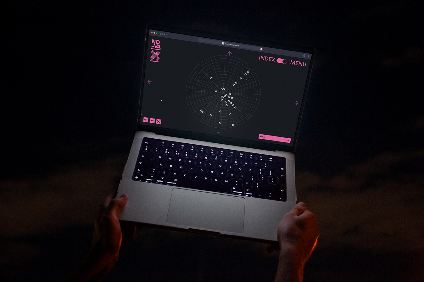
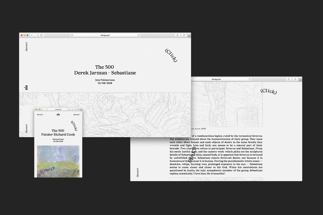
Graphiological Website
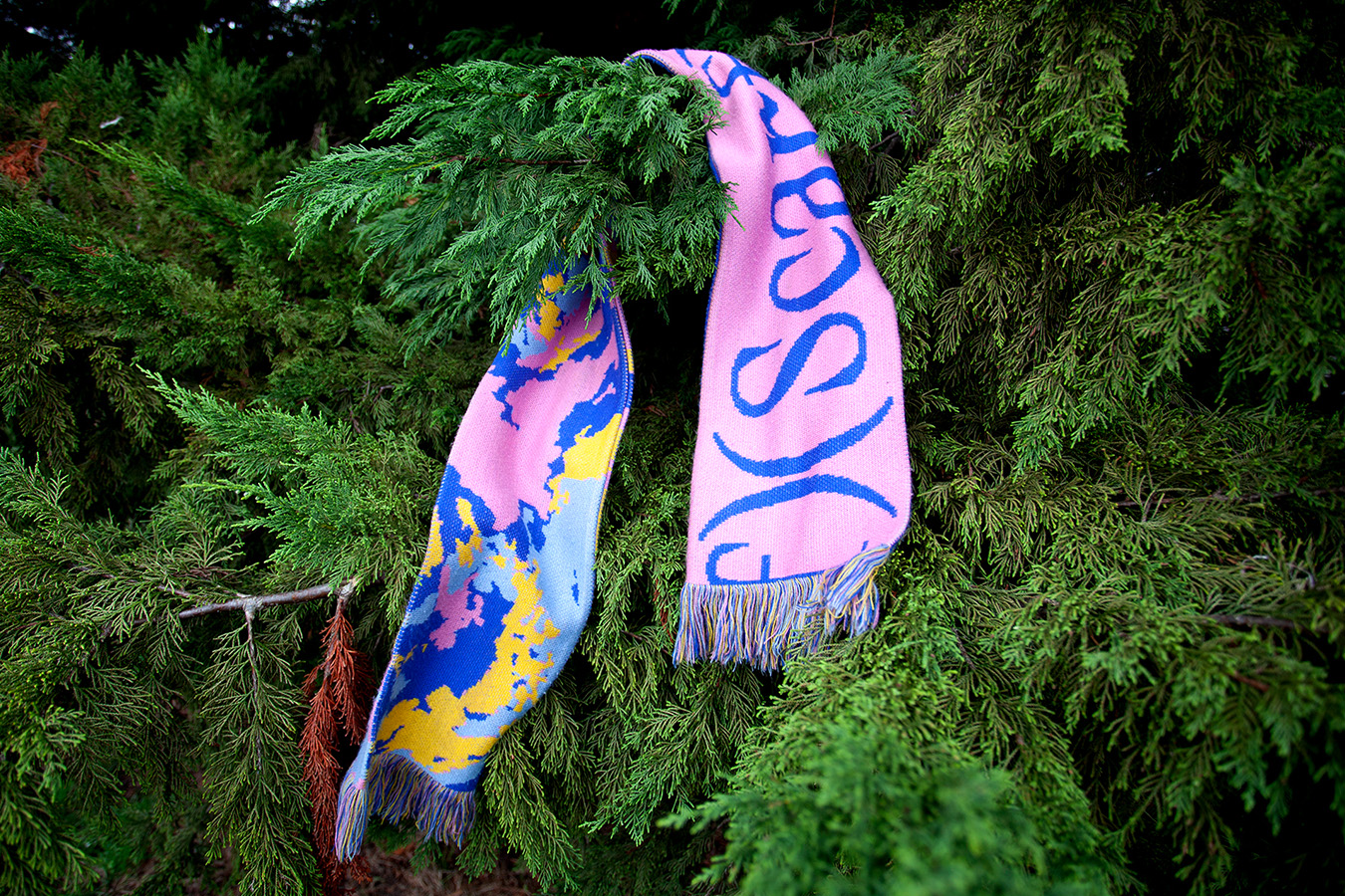
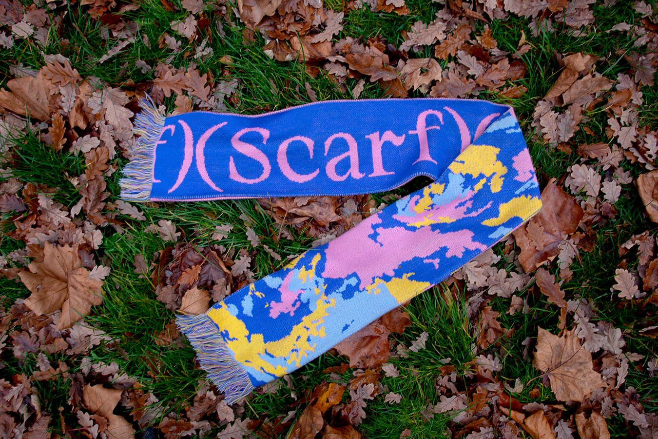
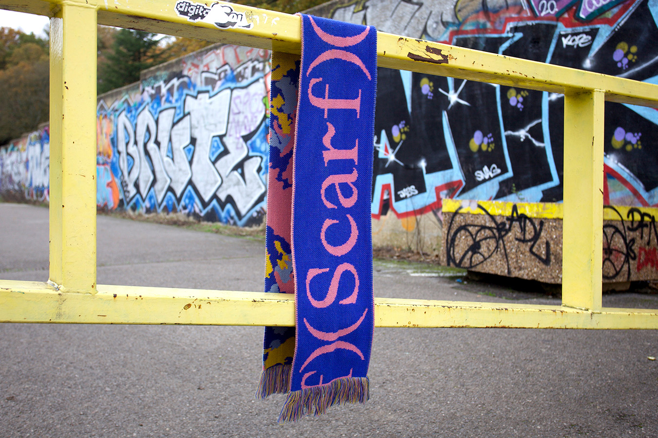
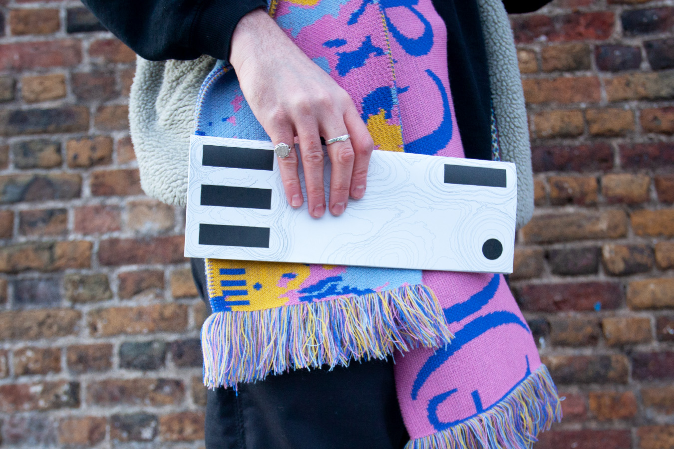
Self-Aware Promotional Scarf
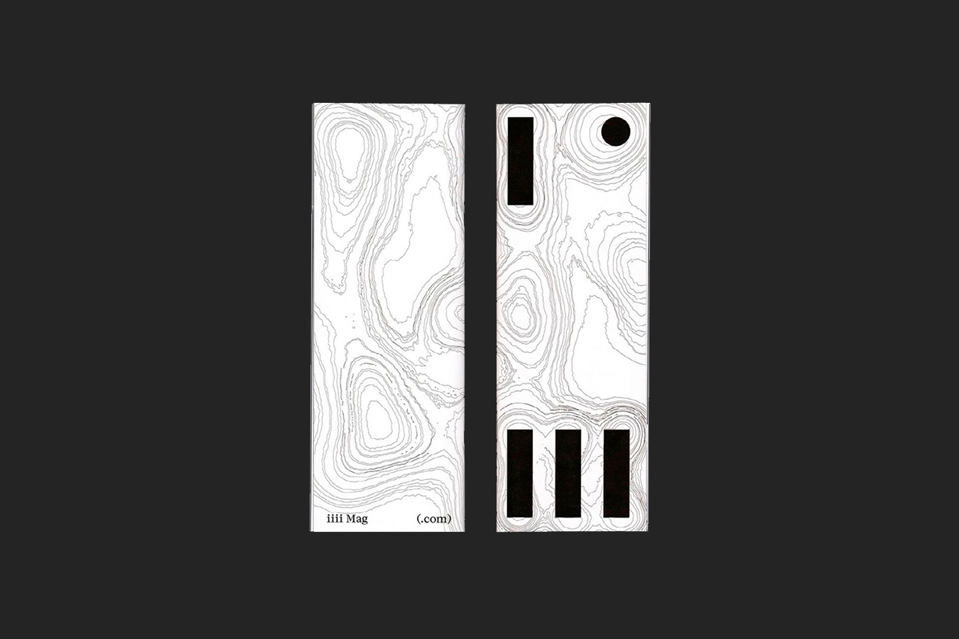
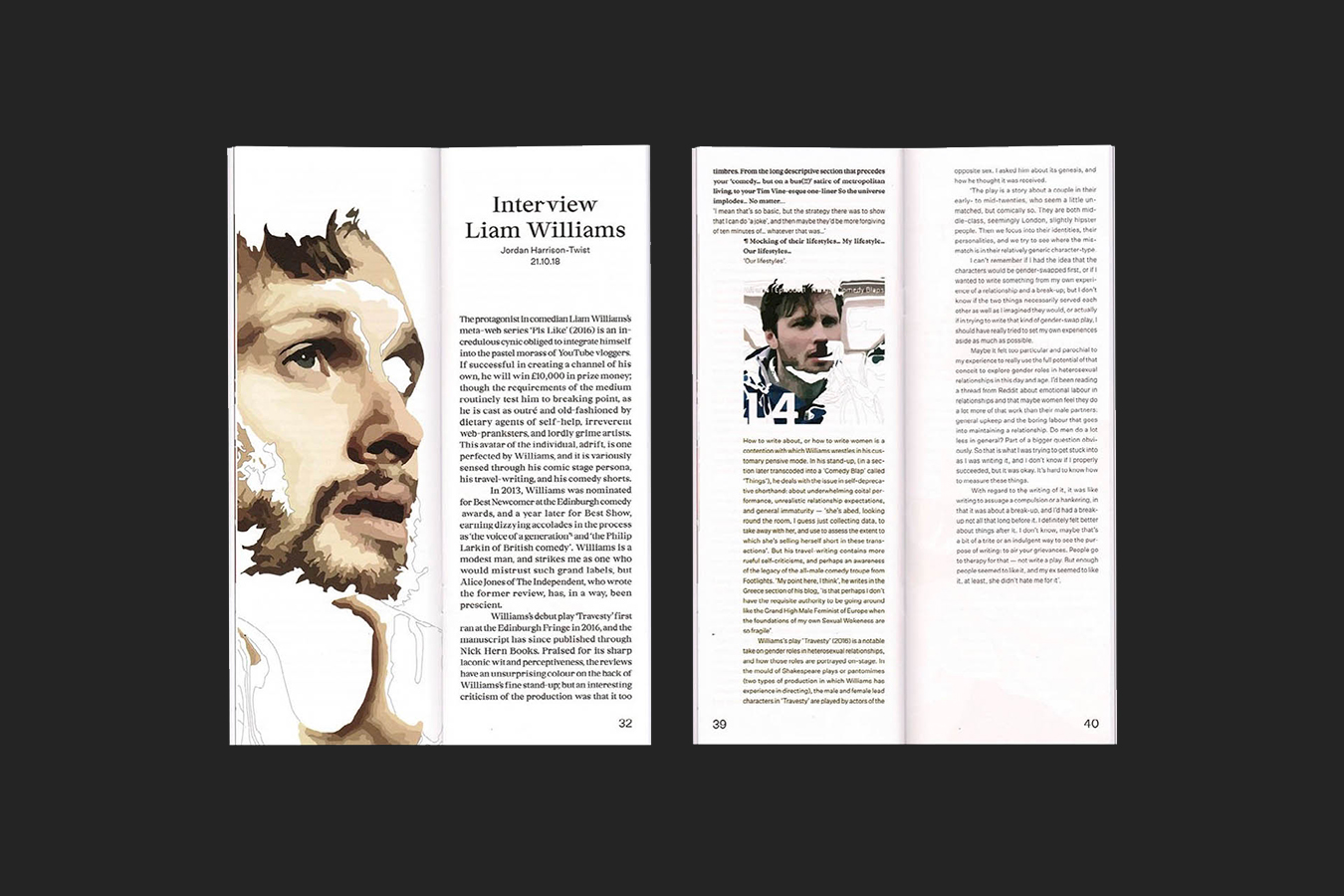
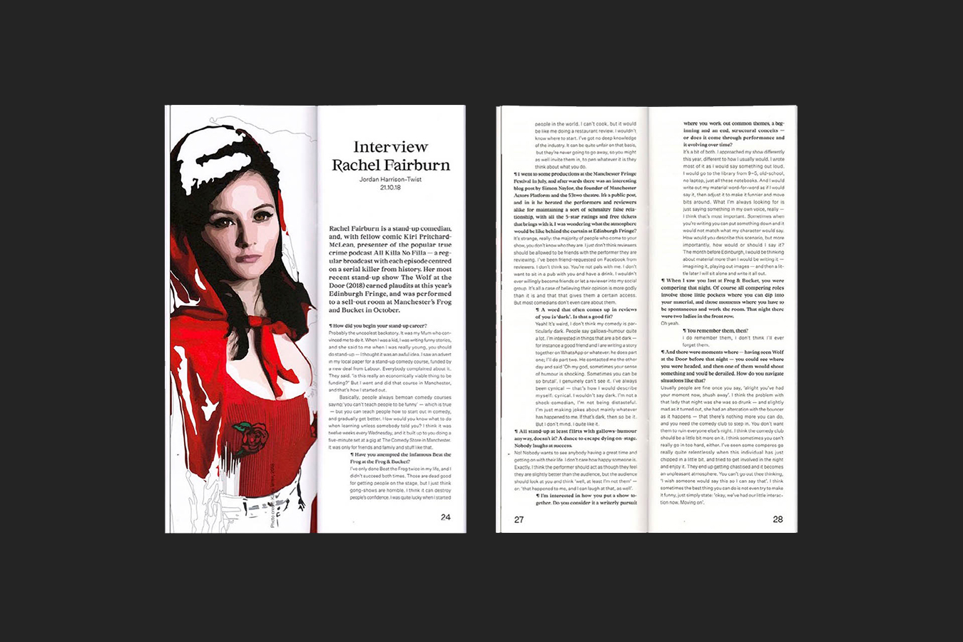
Awkwardly Sized Print Publication

The hero image for Four Eyes or iiii Magazine shows the visual identity for the project through showing a black and white booklet in a persons hand, the person is also wearing a iiii scarf

What would a ‘graphological’ website, publication or scarf look like? How would they act?

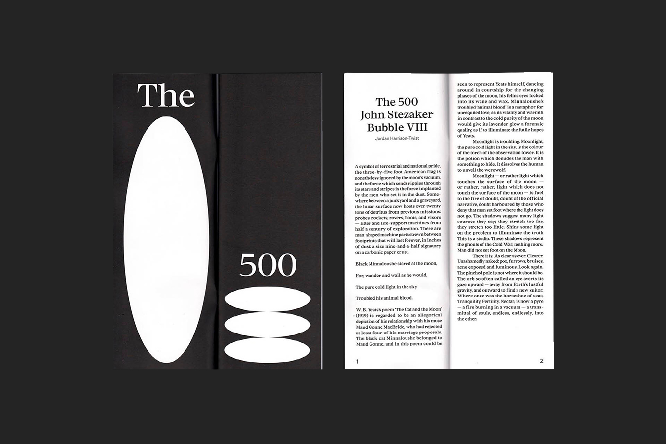
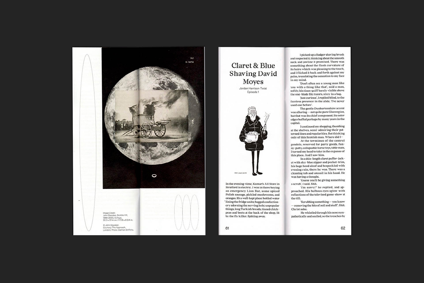
iiii Magazine is an independent arts and culture publication, based in London and Manchester. Combining a self-aware sense of humour, with a love of expansive cultural ephemera - iiii sets no limit on subject, matter or form, publishing a range of content from incisive criticism, personal essays and memories, humour pieces and odes to oddities. All connected by a passion for language and bold singular voices.

Starting from a series of short texts we had requested from iiii, exploring the experience of navigating language on the page, the web and anything in between, the visual identity interpreted a graphological approach described by iiii where ‘tiny things can be portals and emotional resonance can be found in simple grammar’.

Responding to this question of, what would a ‘graphological’ website, publication or scarf look like? How would they act? With this in mind the designed output references the way in which we (as users) interact, engage and read content both on and offline. Examining the characteristics of type, code and interaction on the web in particular - click, hover, meta-tags, transitioning, reading, scrolling, wireframes etc... the aesthetics and interaction of the site attempts to subvert, reveal and highlight these characteristics, in order to take on the witty intellectualism and self mockery of iiii.

Publication Design:

A scan of the front and back covers of the iiii publication, showing the visual identity
An image of the iiii publication, showing one of the chapters
An image of the iiii publication, showing another chapter of the publication, and how Studio Hyte used images & dots to create dynamic and playful layouts
An image on one of the interviews inside the iiii publication, on the left hand side of the spread there's a large illustration of the individual being interviewed, the illustration is designed in such a way to make use of the image treatment that is part of the visual identity
A second image on one of the interviews, on the left hand side of the spread there's a large illustration of the individual being interviewed, the illustration is designed in such a way to make use of the image treatment that is part of the visual identity

Website Design:
Featuring interactive graphological experiences

The image here shows how the iiii visual identity and website works on multiple platforms, in this image we see how the website looks on desktop and on mobile

Self-Aware Scarves:

A scarf produced as part of the iiii project, in this image the scarf is hanging from the branch of a tree. The scarf is based around iiii's ability to be self-aware, the scarf has the word scarf written on it multiple times, sitting on top of bright colours and textures that make the scarf desirable to members of the public
A second image of the scarf, laying on the floor surrounded by scattered leaves
The final image of scarf has the scarf hanging from a metal gate, behind it is graffiti and urban settings

NOVA-X, 2020


A digital and physical exhibition celebrating 10 years of the NOVA awards at Central Saint Martins
alt: Two hands holding up a laptop in front of the night sky, displayed on the laptop is the Nova X website homepage.

Human Resources, 2022


An environmentally responsible exhibition provoking the question of what happens when we start to move to inner (human) resources
alt: A large sign hanging from a ceiling, the sign, made in response to the provocation of the project, uses clip art styling and layering of the Human Resources title
Back to Top