Close
Text Size
Contrast
Cursor Size
Blue and grey hue ufo emoji at a slight slant
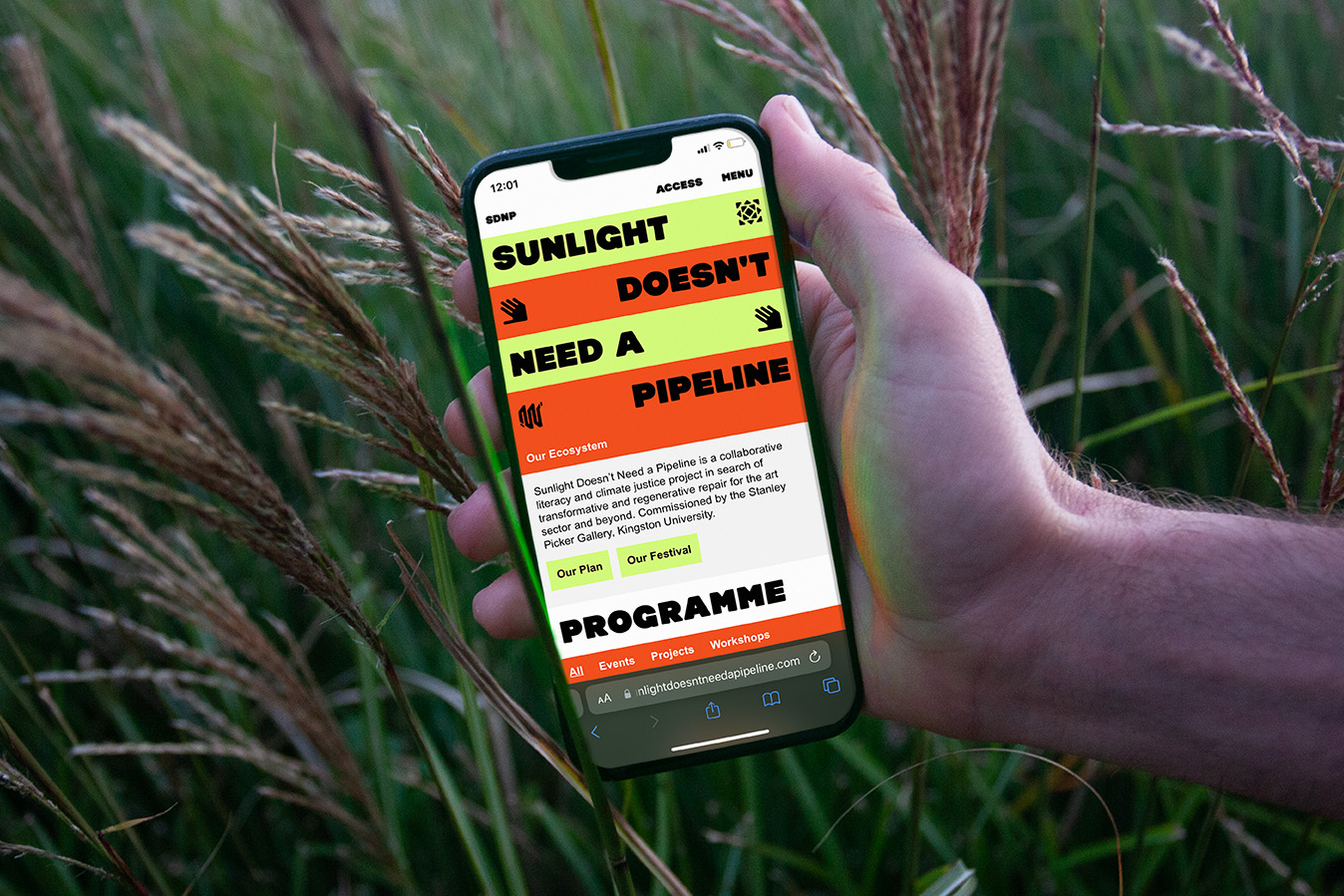
alt: A hand holding a phone in front of some long grass, displayed on the phone is the Sunlight Doesn't Need a Pipeline mobile website.
Sunlight Doesn't Need a Pipeline
A collaborative climate justice project in search of transformative and regenerative repair
Clients:

Dani Admiss, Curator
Stanley Picker Gallery

Services:
#Visual Identity #Website #Exhibition
Deliverables:

Adaptable Visual Identity
3m x 3m Cyanotype Banner
Low-Carbon Website

alt: A hand holding a phone in front of some long grass, displayed on the phone is the Sunlight Doesn't Need a Pipeline mobile website.

How might we design within the intersection of decarbonisation, inclusion and accessibility?

Sunlight Doesn’t Need a Pipeline is a collaborative literacy and climate justice project in search of transformative and regenerative repair for the art sector and beyond. The design outcomes aimed to balance concepts of accessibility, decarbonisation and inclusion. This was a particularly complex design challenge, due to the complicated, intersectional and contrasting nature of these topics.

When producing these outcomes we sought to find medium specific low-carbon processes. This meant avoiding carbon offsetting and using low carbon servers, system fonts and a specifically built 2 bit image converter.

By using the image converter to reduce file sizes we were able to also reduce the emissions produced when loading the website.

The visual identity takes an accessible approach to semiotics and icon design through producing an immediate legible icon for each word in the title. Meanwhile the Orange, Green, Grey and Black colourways were chosen for its low power usage and therefore lower emissions, along with its high contrast for better accessibility.

Find out more about the intentions and process of the project here.
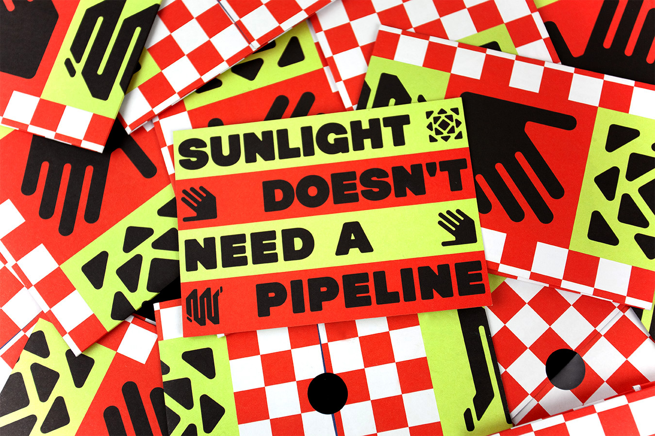
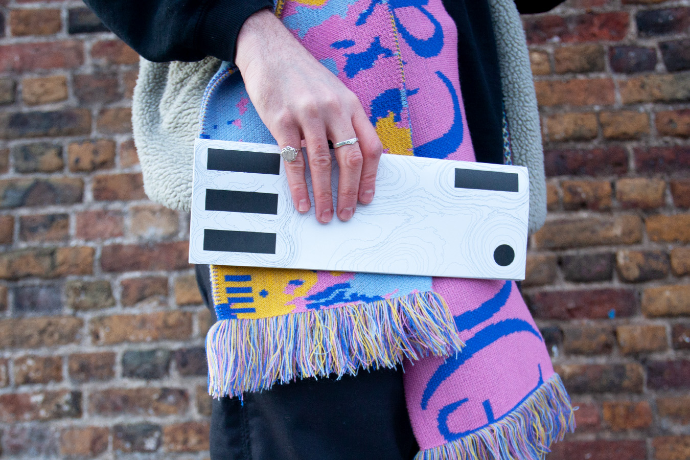
A pile of Sunlight Doesn't Need a Pipeline Postcards and fold out posters.
Collection of SDNP themed postcards & fold out posters
Home Page
Mobile Site
Custom made icons
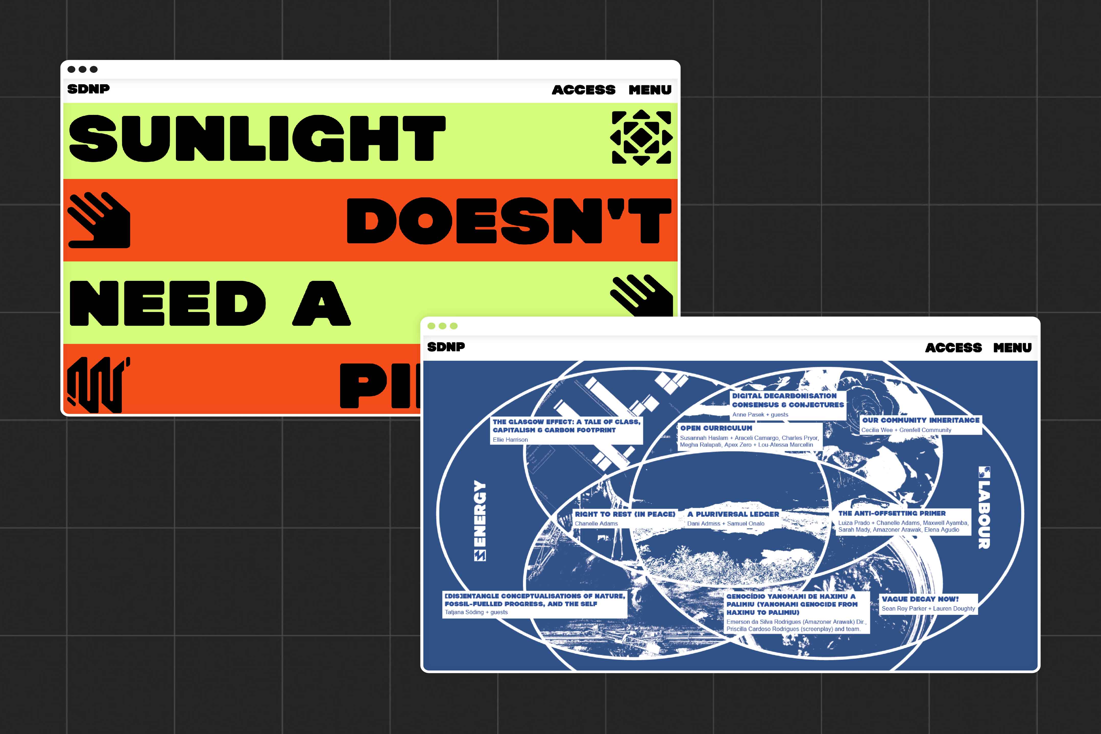
Image shows the SDNP homepage showing SDNP logotype and icons, as well as showing the SDNP digital Venn diagram which was later produced as a large format cyanotype.
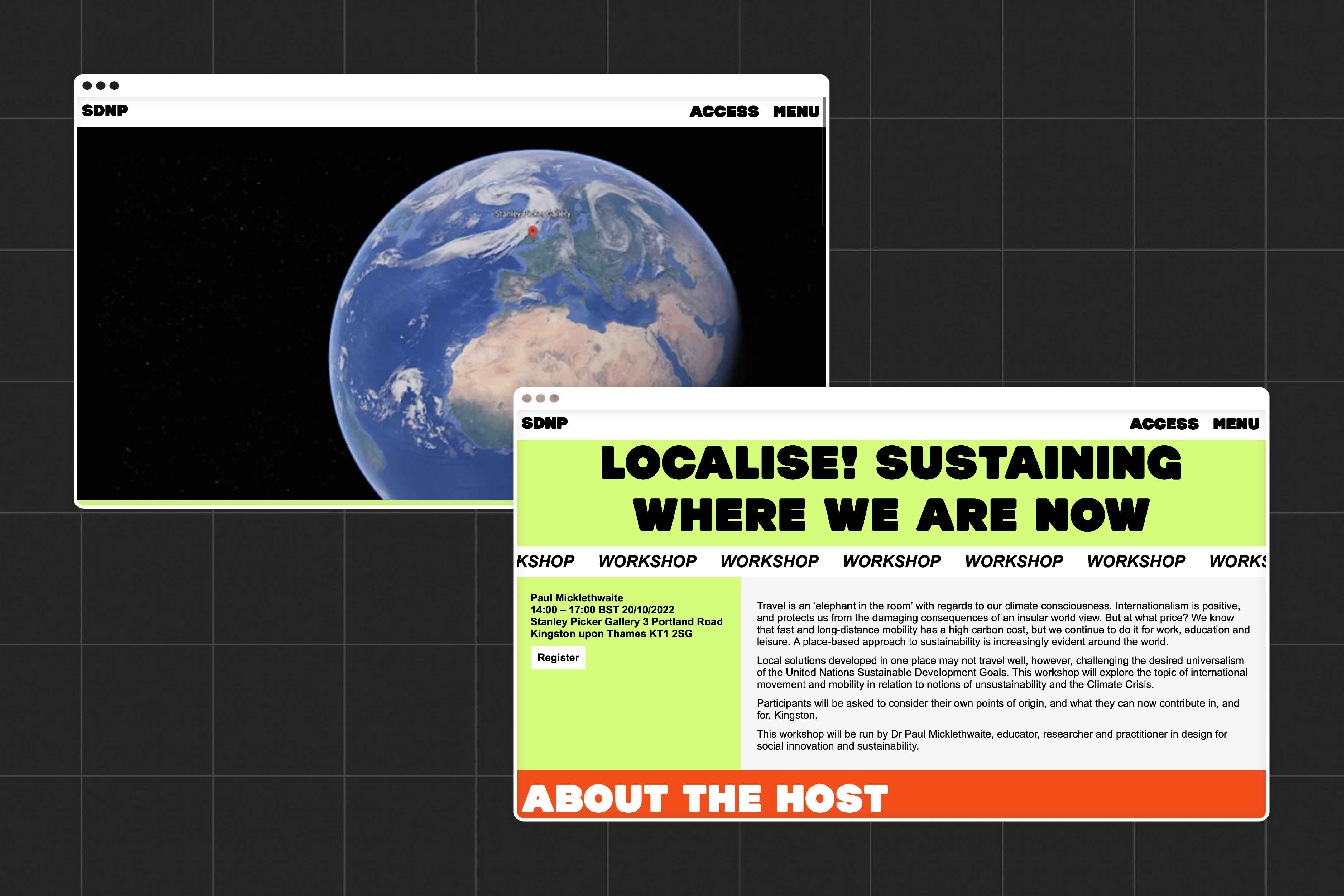
Two images of a workshop page on the SDNP website. The first is a view of the world, with the location of Stanley picker gallery pointed to by a large red pointer, The second shows more information about the 'Localise! Sustaining where we are now' workshop.
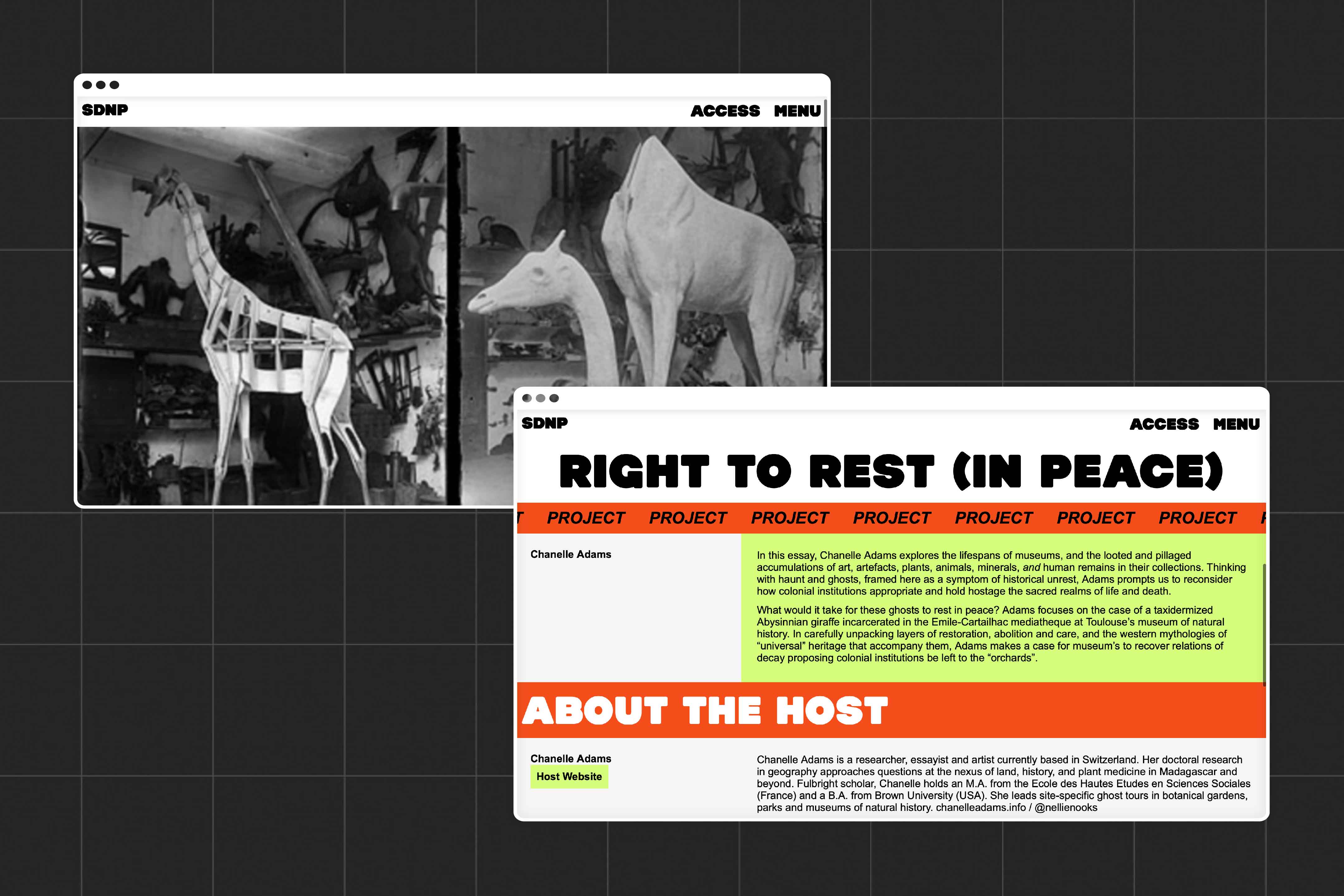
Two further images showing a project which was  part of the SDNP festival, the one on display here uses an image of a taxidermy giraffe, and is entitled 'Right to Rest (in Peace)'. The second image on display shows information about the project and the project host

Empathy Loading, 2020


An online exhibition exploring the intersection of human-machine empathy
alt: A mobile phone sitting on top of a pile of electroics and wires, displayed on the phone is the Empathy Loading moblie site home page.

People's Park Plinth, 2021


Visual identity and spatial experience platforming radical public art
alt: The People's Park Plinth booklet is shown laying on a rock inside Finsbury Park
Back to Top